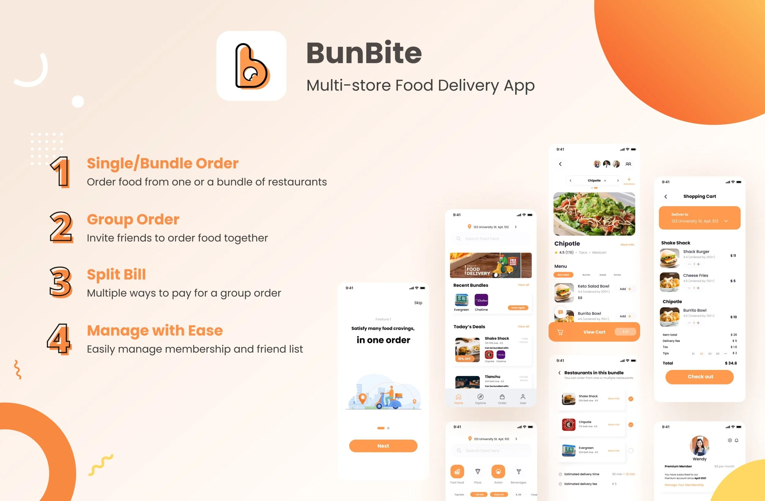
Overview
Duration: Feb, 2021 - Apr, 2021 (12 weeks) Team: Yuqiao Wang, Joanna Ye, Yichuan Zhang, Qi Zhou (Previously went by Ellie)
Course: UX Research and Design Mastery Course (Taught by Professor Lija Hogan)
My Role: UX Researcher and Designer
Skills learned: Interviews, Iterative testing, Wireframes, Agile development
Problem Statement
As many cities are being influenced by the COVID-19 Lockdown, more and more people use food delivery services to order food from restaurants. However, most of the food delivery apps only allow placing orders from one restaurant at a time.
What if I want to order an entry from one store with a dessert at the store right next to it? I would have to place two separate orders, pay service and delivery fees twice, and make two drivers travel through the same route at roughly the same time.
Having personally experienced this problem several times, we started thinking if it is possible to design a delivery app/service that allows placing multi-restaurant orders for food delivery. We would like to explore how to help people select food from multiple restaurants in one order while adding profits for local restaurants.
Our Creative Process
Generative Research
Competitive Analysis
We started our design process by analyzing the current competitor landscape. We found that while there are a wide variety of food delivery apps in the market, their target users are similar and the design of basic functions is also similar. In terms of the business model, most competitors use commission and membership subscriptions as their main source of income.
Among all the competitors that we analyzed, only DoorDash and Chowbus offer restaurant bundling services. Users can choose from a selection of restaurants and place an order from multiple restaurants without extra delivery fee. As for group ordering, DoorDash, EatStreet and UberEats offer this functionality but they only support ordering from a single restaurant. Please see our detailed competitor analysis chart.
User Interviews
Besides the competitive analysis we did, we also conducted 8 interviews with potential customers of the food delivery app. Our objectives for the interview are:
Understand pain points existed among customers when using current food delivery apps
Discover potential features that users desire among those apps
See whether there is a need for multi-store ordering
MVP list and User Stories
With this objective, our group developed an interview protocol and reached out to our personal network for a 30-40 minutes interview. As a team we interviewed 8 users. After those interviews, we synthesized our findings in the interview synthesis sheet. Interviews helped us conclude a list of MVP features and the value of them to users:
Initial Sketch
Based on the MVP feature lists, our group started the first round of sketch and brainstorm. Please see the following sketches for the first round of design:
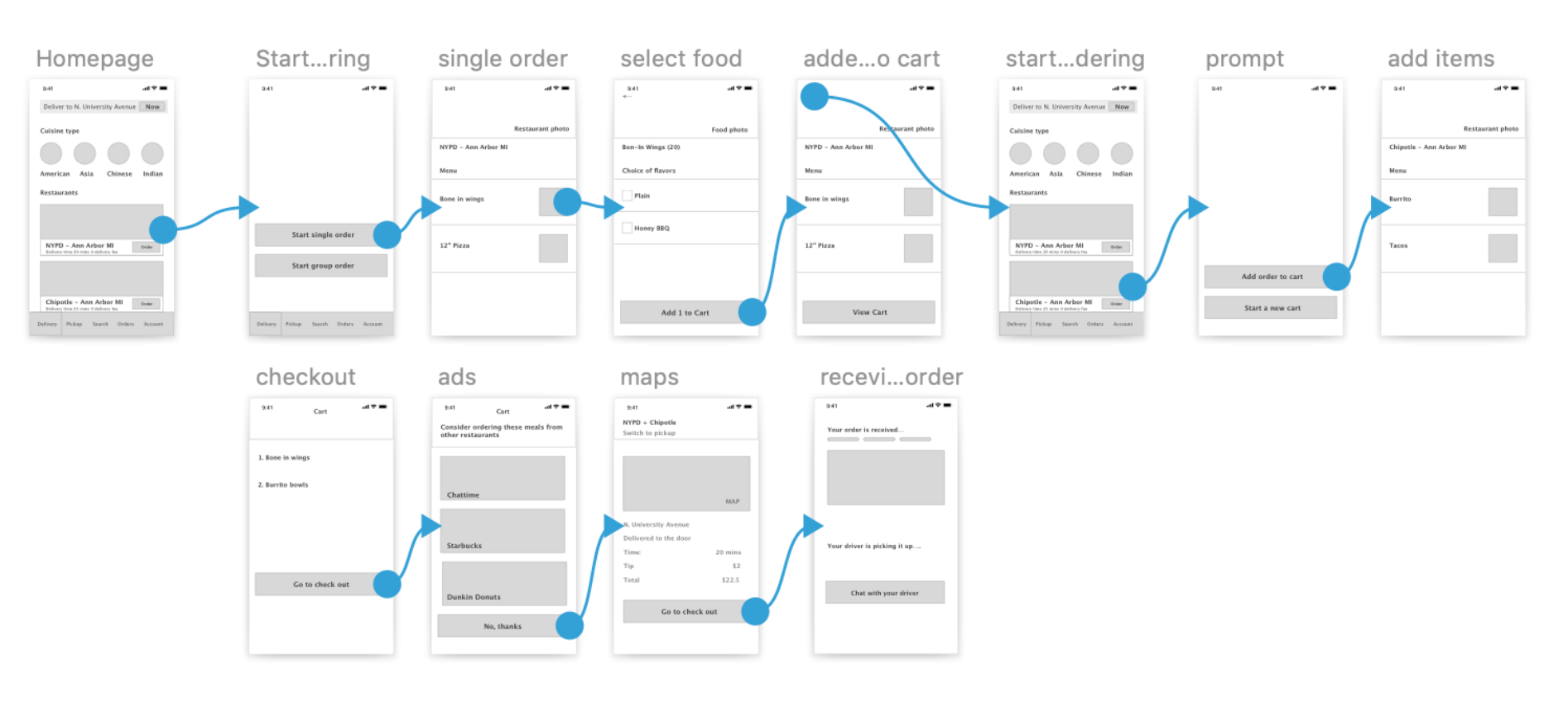
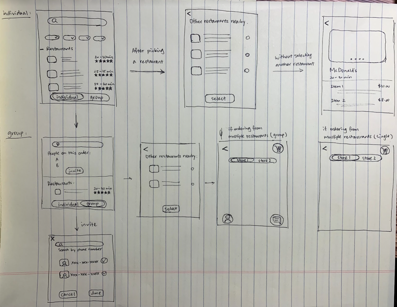
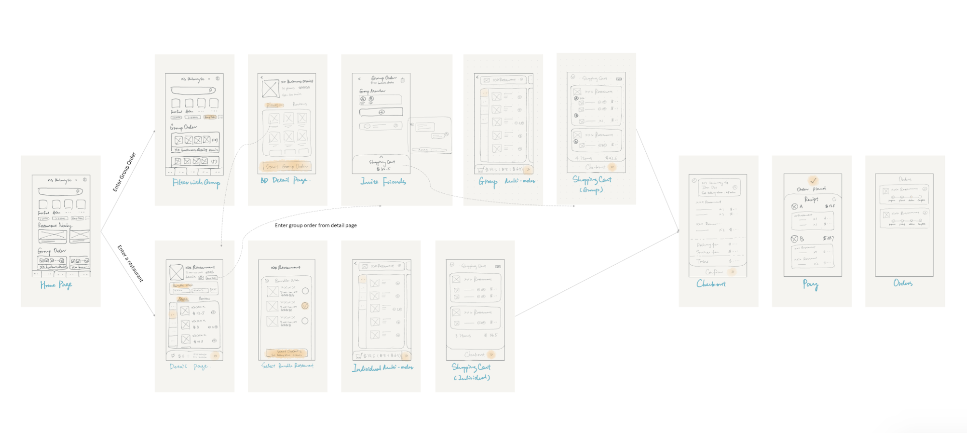
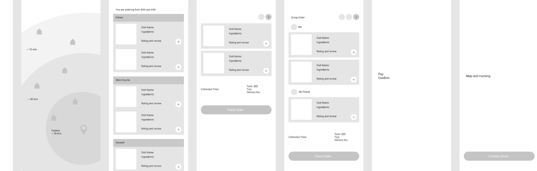
Converge Design Ideas
The team then discussed the design during a weekly team meeting. We found that even though our ideas differ from interface to interface, there are two major distinctions among those four prototypes:
Users can start with ordering from one restaurant OR they can start ordering by choosing nearby restaurants grouped by bundles
Users can choose meals based on different restaurants OR they can select meals based on different categories (e.g. Starter, Main, Dessert, etc.)
As a result, we decided to worked on further combine the four prototypes into two designs. Please see our outcome for this round of design sprint:
User flow of starting with single restaurant (Joanna / Ellie)
User flow of starting with bundled restaurant (Yuqiao / Yichuan)
First round of user testing
In the above two versions, the information was structured in different ways but both of them are pertinent to our objective. We would like to find out which one would be more intuitive for users before diving deeper into design details. Therefore, we created a user testing plan that would help us gather users’ unbiased thoughts on which flow is more intuitive to help them complete certain task. Since our time and sample size are limited, we focused on discovering “why” they think one of them is more intuitive. Please view the plan our group created. Our group conducted 1 pilot test and 4 usability test sessions with potential users of the app.
A screenshot of our results for the first round of usability test (4 usability test sessions)
Our results showed that users indicated that selecting meals based on restaurants aligns more with their current food ordering habits. However, there wasn’t a difference on whether starting with a single restaurant or starting with the bundled restaurant could help users could perform the task better. (see the screenshot for first round of usability test results)
Based on the feedback from our instructor, we decided to focus on qualitative testing rather than quantitative testing. It is very possible that both designs can occur at the same time based on different use cases.
Based on this feedback, our group decided to combine the two versions into a single user flow that supports different user goals and product use cases. After a team brainstorm session, we came up with the following merged prototype:
Merged user flow
Second round of user testing
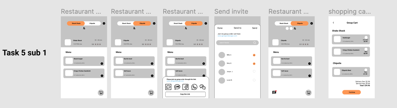
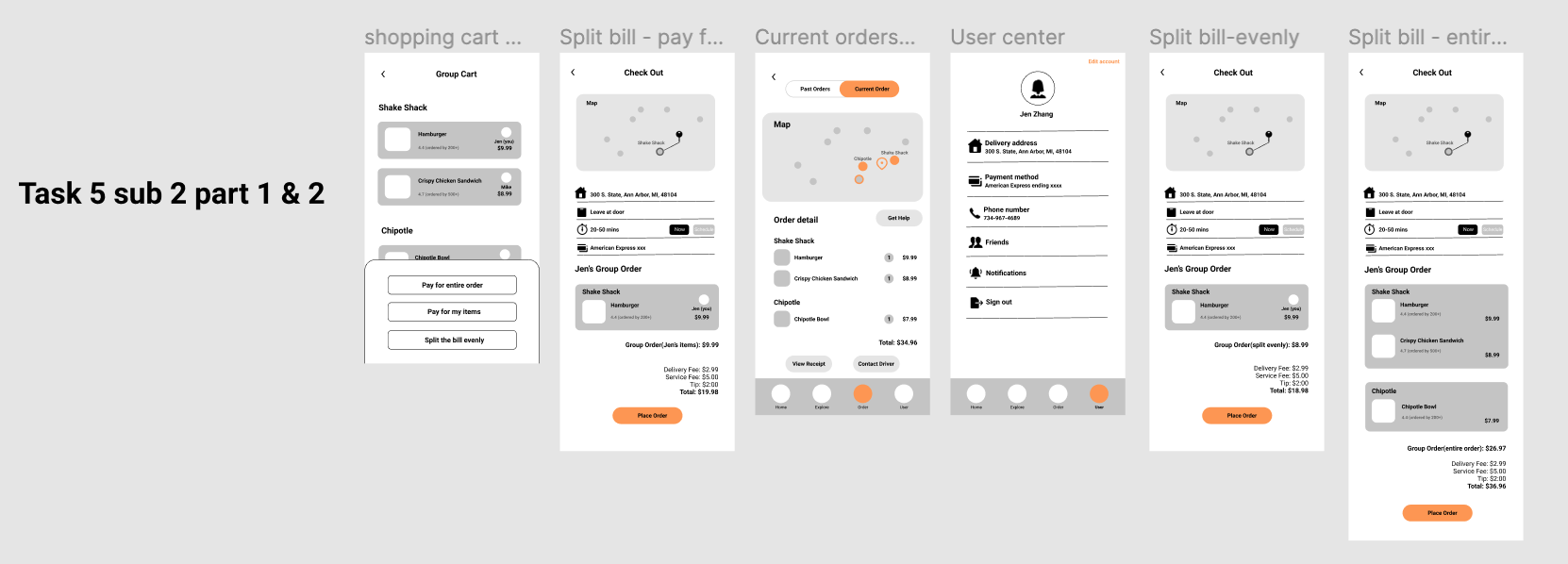
The merged design was able to meet the needs of both user groups. We decided to further refined more design details and added additional features and pages, such as on-boarding, inviting friends, order confirmation, bill splitting, etc. I was responsible for designing the flow of group ordering and inviting friends to place the order. With the mid-fidelity prototype, we were able to conduct a second round of usability test.
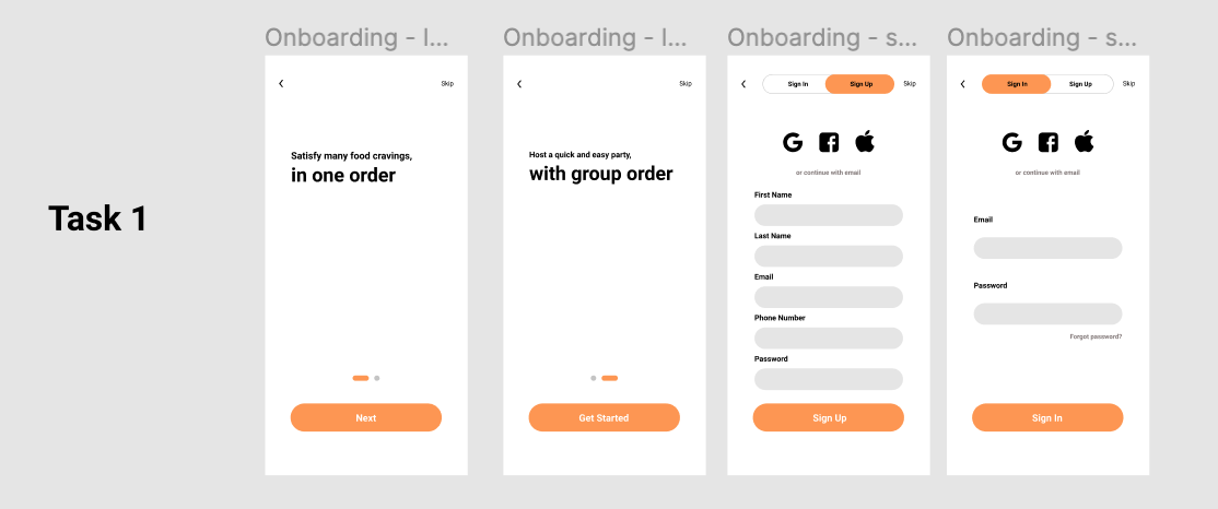
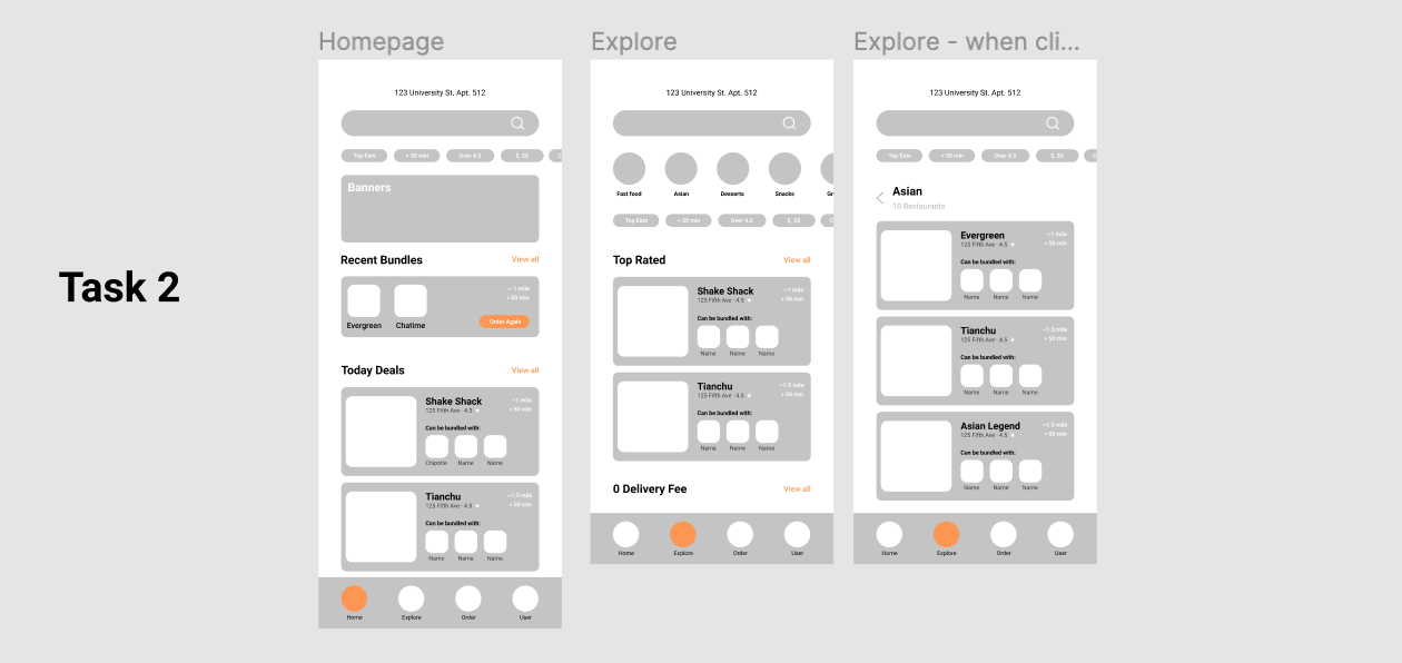
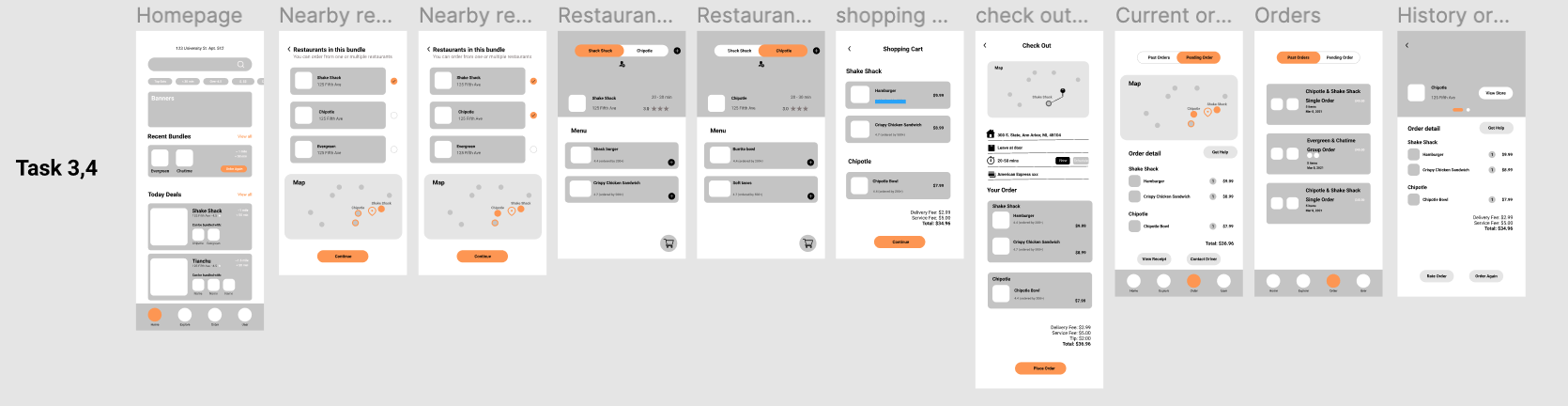
I worked with another researcher Joanna to develop this user testing protocol. The protocol consists of 5 major tasks along with some sub-tasks. Please see below images for all the user flows that we tested. At this point, instead of looking at the user's preferences on a specific flow, our focus was more on obtaining detailed feedback on the interface design and the interactions to complete given tasks.
User testing findings and final design
Design changes inspired by second round of user testing
Due to the time limitation of our project, we decided to discuss and make design decisions based on key takeaways from each user task. Please see the picture on the right for design changes based on the findings from each user task.
Based on those findings and design recommendations from the second round of user testing, Yichuan and Yuqiao helped us make the final design changes and delivered high-fidelity prototypes. Please see the walkthrough of the app’s functionalities and its core features through the following video: